
In this post, I will use clustering algorithm to perform Customer Segmentation for an e-commerce store. It will helps the business to better understand its customers, and modify its products and Marketing strategy based on the specific segments. I will be using a widely known data set from UCI Machine Learning Repository.
First let’s load the required packages.
library(tidyverse)
library(readxl)
library(kableExtra)
library(flextable)
library(DataExplorer)
library(dlookr)
library(highcharter)
library(tm)
library(wordcloud)
library(corrplot)
library(viridis)
library(xts)
library(rfm)
library(clustertend)
library(factoextra)
library(NbClust)
library(clValid)
library(fpc)
Load the dataset and take a quick look.
df<-read_excel("Online_Retail.xlsx")
head(df,5)
str(df)
summary(df) %>% kable() %>% kable_styling()
n_distinct(df$CustomerID)
n_distinct(df$Description)
n_distinct(df$Country)
The dataset consists of 541,909 rows and 8 features. Most of features have correct formats, but some features need to be converted for better analysis in the next step, like InvoiceNo and the InvoiceDate. The dataset involves 25900 transactions, 4373 customers, 4212 products and 38 country
Data Preparation
Data Cleaning
Let’s check and deal with missing values.
cat("Number of missing value:", sum(is.na(df)), "\n")
plot_na_pareto(df)
Number of missing value: 136534 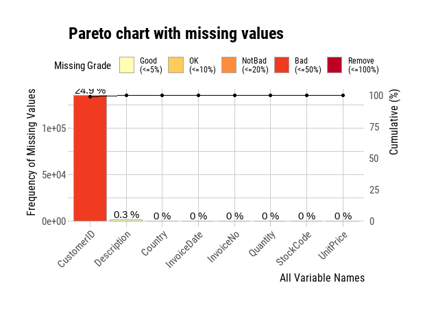
We find that there are 25 percent of CustomerIDs missing, and a very small percentage of Descriptions missing from the data. CustomerID can not be empty for customer segmentation analysis, and at the same time, the dataset is rich enough for serving our purpose, so we will remove the rows with missing CustomerID from the data. For the NAs on description we will replace them with an empty string value.
df<-df %>%
  na.omit(CustomerID)
df$Description<-replace_na(df$Description, "N/A")
Check and deal with outlines
diagnose_outlier(df) %>% flextable()
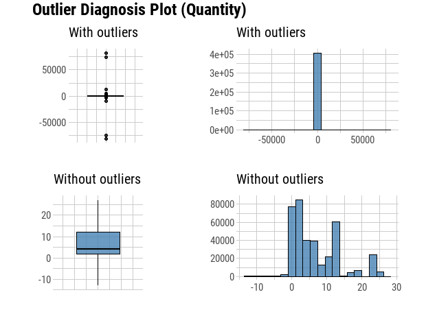
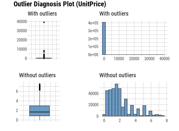
plot_outlier(df,Quantity, UnitPrice)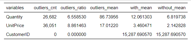
# Check minimum UnitPrice
min(df$UnitPrice)
From the plots we can see that there are some negative values in the quantity, which are canceled transactions. Before we remove them, we need find out the original transactions, and then remove both negative transactions and their positive counterparts.
# Find canceled orders.
order_canceled <- df %>%
  filter(Quantity<0) %>%
  arrange(Quantity)
head(order_canceled, 2)
df %>%
  filter(CustomerID == 16446)
# A tibble: 2 × 8
InvoiceNo StockCode Description Quantity InvoiceDate UnitPrice CustomerID Country
<chr> <chr> <chr> <dbl> <dttm> <dbl> <dbl> <chr>
1 C581484 23843 PAPER CRAFT , LITTLE BIRDIE -80995 2011-12-09 09:27:00 2.08 16446 United Kingdom
2 C541433 23166 MEDIUM CERAMIC TOP STORAGE JAR -74215 2011-01-18 10:17:00 1.04 12346 United Kingdom
# A tibble: 4 × 8
InvoiceNo StockCode Description Quantity InvoiceDate UnitPrice CustomerID Country
<chr> <chr> <chr> <dbl> <dttm> <dbl> <dbl> <chr>
1 553573 22980 PANTRY SCRUBBING BRUSH 1 2011-05-18 09:52:00 1.65 16446 United Kingdom
2 553573 22982 PANTRY PASTRY BRUSH 1 2011-05-18 09:52:00 1.25 16446 United Kingdom
3 581483 23843 PAPER CRAFT , LITTLE BIRDIE 80995 2011-12-09 09:15:00 2.08 16446 United Kingdom
4 C581484 23843 PAPER CRAFT , LITTLE BIRDIE -80995 2011-12-09 09:27:00 2.08 16446 United Kingdom# We can Find the original Orders by selecting the same customer ID, product description, country and quantity as those in the canceled orders.
orignal_info <- order_canceled %>%
subset(select = -c(InvoiceNo, InvoiceDate)) %>%
mutate(Quantity = Quantity *(-1))
# Remove the original Order that will be canceled
df<- anti_join(df, orignal_info)
# filter all canceled orders , as well as the rows where the UnitPrice is 0.
df <- df %>%
filter(Quantity > 0) %>%
filter(UnitPrice >0)
# Check the outlier again
diagnose_outlier(df) %>% flextable()
plot_outlier(df, Quantity, UnitPrice)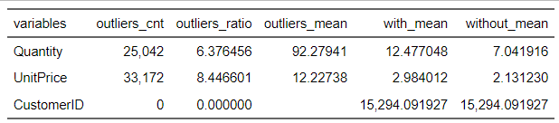
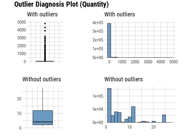
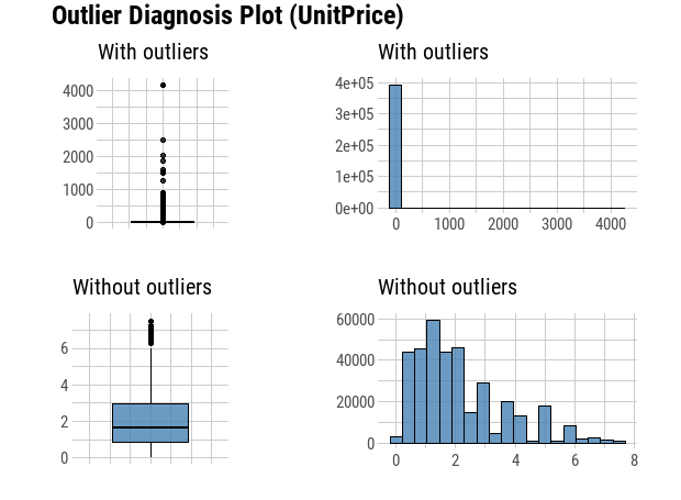
We can see now that our outlier Diagnosis Plot looks more appropriate and accurate for the analysis. We will not treat those positive outlier, since it is a custormer segmentation problem, and the outlier percentage of quantity and unitprice is around 6.38% and 8.45%, those outliers might be important affecting factors on specific segmentations.
Feature Engineering
Create sales for each transaction
df <- df %>%
  mutate(sales = Quantity * UnitPrice )
Create new features: date, time , year, month, hour, day of weak from InvoiceDate for the analysis in the next step.
# Extract new date and time columns from InvoiceDate column
df$InvoiceDate <- as.character(df$InvoiceDate)
df$date <- sapply(df$InvoiceDate, FUN = function(x) {strsplit(x, split = '[ ]')[[1]][1]})
df$time <- sapply(df$InvoiceDate, FUN = function(x) {strsplit(x, split = '[ ]')[[1]][2]})
# Create new month, year and hour columns
df$year <- sapply(df$date, FUN = function(x) {strsplit(x, split = '[-]')[[1]][1]})
df$month <- sapply(df$date, FUN = function(x) {strsplit(x, split = '[-]')[[1]][2]})
df$hour <- sapply(df$time, FUN = function(x) {strsplit(x, split = '[:]')[[1]][1]})
# Convert date format to date type
df$date <- as.Date(df$date, "%Y-%m-%d")
# Create day of the week feature
df$day_week <- wday(df$date, label = TRUE)
Exploratory Data Analysis
# Take a look of the transactions in each county
bar <- ggplot(data = df) +
  geom_bar(
    mapping = aes(x = Country, fill = Country),
    show.legend = FALSE,
    width = 1
  ) +
  theme(aspect.ratio = 1) +
  labs(x = NULL, y = NULL, title = "Transaction per Country")
bar + coord_flip()
bar + coord_polar()
T_excludeUK <- df %>%
filter(Country != "United Kingdom")
bar <- ggplot(data = T_excludeUK) +
geom_bar(
mapping = aes(x = Country, fill = Country),
show.legend = FALSE,
width = 1
) +
theme(aspect.ratio = 1) +
labs(title = "Transaction per Country Excluding UK")
bar + coord_flip()
bar + coord_polar()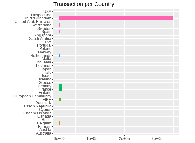
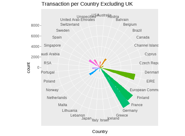
We can see that the most of the orders come from the UK. To get a better look of the transactions that happened outside the UK, we will plot invoices excluding UK this time and lets arange it also in a descending order.
# Take a look of the sales in each county
Sales_country <- df %>%
  group_by(Country) %>%
  summarize(sales = round(sum(sales),0), transcations=n_distinct(InvoiceNo),customers = n_distinct(CustomerID))  %>%
  ungroup() %>%
  arrange(desc(sales))
# Sales map By Country
Sales_country$log_sales <- round(log(Sales_country$sales),2)
highchart(type = "map") %>%
  hc_add_series_map(worldgeojson,
                    Sales_country,
                    name="sales in online store (log)",
                    value = "log_sales", joinBy = c("name","Country")) %>%
  hc_title(text = "Sales In Online Store By Country (log)") %>%
  hc_colorAxis(stops = color_stops()) %>%
  hc_legend(valueDecimals = 0, valueSuffix = "%") %>%
  hc_mapNavigation(enabled = TRUE)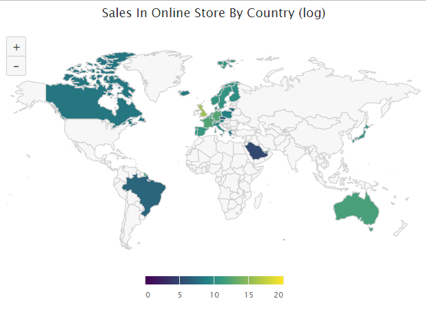
#Top 10 sales with their transactions by country excluding UK
Top_10_exclUK <- Sales_country %>%
  filter(Country != "United Kingdom") %>%
  top_n(10,sales)
Top_10_exclUK

highchart() %>%
  hc_xAxis(categories = Top_10_exclUK$Country) %>%
  hc_add_series(name = "Sales", data = Top_10_exclUK$sales) %>%
  hc_add_series(name = "Transactions", data = Top_10_exclUK$transcations) %>%
  hc_chart(
    type = "column",
    options3d = list(enabled = TRUE, beta = 15, alpha = 15)
  ) %>%
  hc_title(
    text="Top 10 Sales with their Transactions excl. UK"
  )
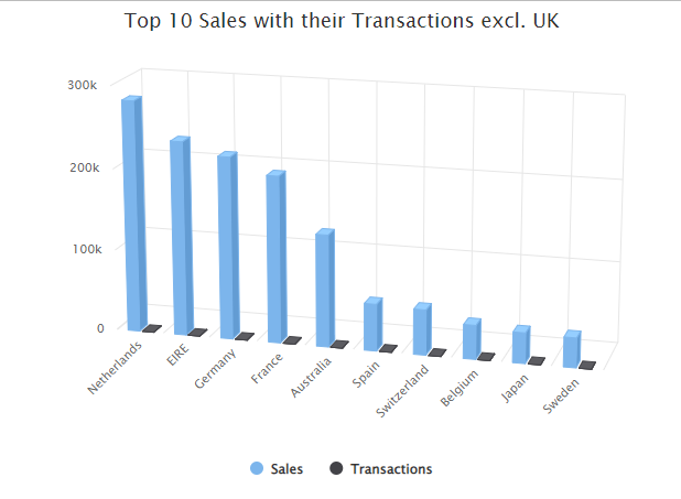
We can see that the orders of the online store come mainly from the UK, and the next top 5 countries by sales with descending order are Netherlands,EIRE (Ireland), Germany, France and Australia.
#Top 5 sales by country excluding UK over time
top_5 <- df %>%
  filter(Country == 'Netherlands' | Country == 'EIRE' | Country == 'Germany' | Country == 'France'
         | Country == 'Australia') %>%
  group_by(Country, date) %>%
  summarise(sales = sum(sales), transactions = n_distinct(InvoiceNo),
                   customers = n_distinct(CustomerID)) %>%
  mutate(aveOrdVal = (round((sales / transactions),2))) %>%
  ungroup() %>%
  arrange(desc(sales))

head(top_5)
ggplot(top_5, aes(x = date, y = sales, colour = Country)) + geom_smooth(method = 'auto', se = FALSE) +
  labs(x = ' Country', y = 'Revenue', title = 'Sales by Country over Time') +
  theme(panel.grid.major = element_line(colour = NA),
        legend.text = element_text(colour = "skyblue4"),
        legend.title = element_text(face = "bold"),
        panel.background = element_rect(fill = NA),
        legend.key = element_rect(fill = "gray71"),
        legend.background = element_rect(fill = NA))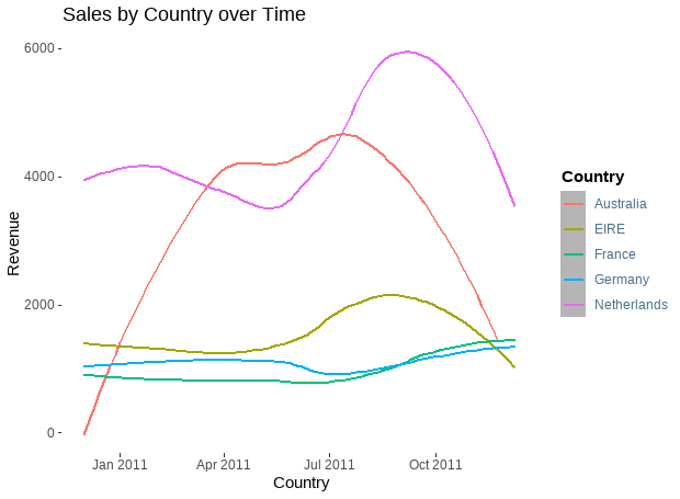
We observe that the Netherlands and Australia had a sharp drop in sales after the summer of 2021.
# Take a look of the total sales by date
Sales_date <- df %>%
  group_by(date) %>%
  summarise(sales = sum(sales)) %>%
  ungroup()

time_series <- xts(
  Sales_date$sales, order.by = Sales_date$date)

highchart(type = "stock") %>%
  hc_add_series(time_series,
                type = "line",
                color = "green") %>%
  hc_title(text = "Sales By Date") %>%
hc_subtitle(text = "Sales generated from the online store") 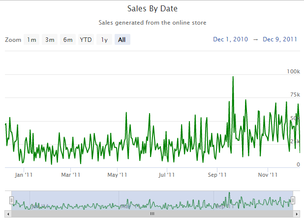
We can see a steady increase in sales over time for the retail store with a peak on September 20.
# Observe transaction and sales patterns
# Sales by Day of Week
df %>%
  group_by(day_week) %>%
  summarise(sales = sum(sales))  %>%
  ungroup()%>%
  hchart(type = 'column', hcaes(x = day_week, y = sales)) %>%
  hc_yAxis(title = list(text = "Sales")) %>%
  hc_xAxis(title = list(text = "Day of the Week")) %>%
  hc_title(text = "Sales by Day of Week")

# Transaction by Day of Week
df %>%
  group_by(day_week) %>%
  summarise(Transaction = n_distinct(InvoiceNo))  %>%
  ungroup() %>%
  hchart(type = 'column', hcaes(x = day_week, y = Transaction)) %>%
  hc_yAxis(title = list(text = "Transaction")) %>%
  hc_xAxis(title = list(text = "Day of the Week")) %>%
  hc_title(text = "Transaction by Day of Week")

# Sales by Hour of The Day
df %>%
  group_by(hour) %>%
  summarise(sales = sum(sales)) %>%
  ungroup() %>%
  hchart(type = 'column', hcaes(x = hour, y = sales)) %>%
  hc_yAxis(title = list(text = "Sales")) %>%
  hc_xAxis(title = list(text = "Hour of the Day")) %>%
  hc_title(text = "Sales by Hour of The Day")

# Transaction by Hour of The Day
df %>%
  group_by(hour) %>%
  summarise(Transaction = n_distinct(InvoiceNo))  %>%
  ungroup() %>%
  hchart(type = 'column', hcaes(x = hour, y = Transaction)) %>%
  hc_yAxis(title = list(text = "Transaction")) %>%
  hc_xAxis(title = list(text = "Hour of the Day")) %>%
  hc_title(text = "Transaction by Hour of The Day")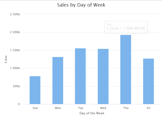
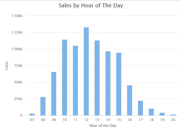
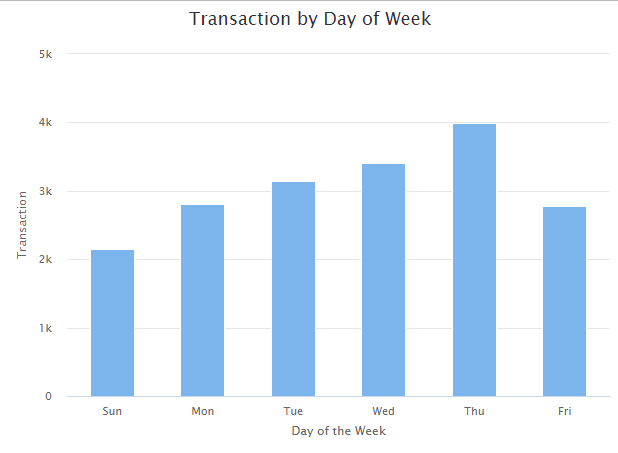
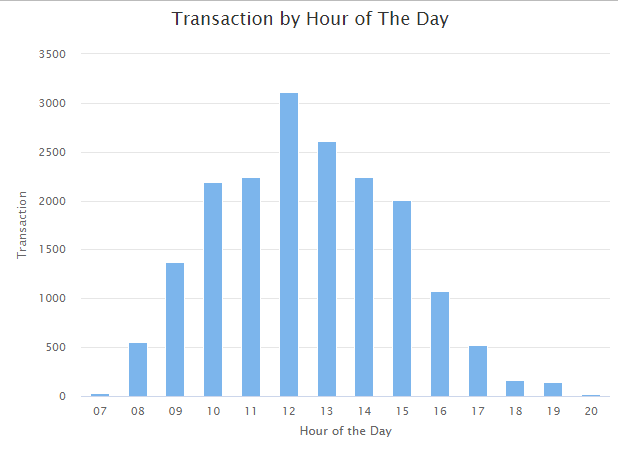
By observing transaction and sales patterns, we find that the peek hours of the day in the online store are from 10 am to 15 pm, and Thursday is the busiest day.
# Analysis products  categories by extracting and cleaning the text information
# Unique product
products_list <- unique(df$Description)
docs <- Corpus(VectorSource(products_list))
toSpace <- content_transformer(function (x , pattern ) gsub(pattern, " ", x))
docs <- tm_map(docs, toSpace, "/")
docs <- tm_map(docs, toSpace, "@")
docs <- tm_map(docs, toSpace, "\\|")
# Convert the text to lower case
docs <- tm_map(docs, content_transformer(tolower))
# Remove numbers
docs <- tm_map(docs, removeNumbers)
# Remove English common stop words
docs <- tm_map(docs, removeWords, stopwords("english"))
# Remove your own stop word
# specify your stop words as a character vector like color, texture,size, etc.
docs <- tm_map(docs, removeWords, c("pink", "blue","red","set","white","black","sign","ivory","cover","hanging","wall","green","metal","vintage","heart", "paper", "silver", "glass","large","small","holder"))
# Remove punctuations
docs <- tm_map(docs, removePunctuation)
# Eliminate extra white spaces
docs <- tm_map(docs, stripWhitespace)

dtm <- TermDocumentMatrix(docs)
m <- as.matrix(dtm)
v <- sort(rowSums(m),decreasing=TRUE)
d <- data.frame(word = names(v),freq=v)
# Explore the 20 most common words from product Descriptions,
set.seed(1234)
wordcloud(words = d$word, freq = d$freq, min.freq = 1,
          max.words=20, random.order=FALSE, rot.per=0.35,
          colors=brewer.pal(8, "Dark2"))
The mainly products offered by the online store are decoration products, Christmas related products, bags, flowers and presents.
Customer Segmentation & RFM analysis & Clustering
Create RFM Features
Recency: how recently did customers purchase or How much time has elapsed between the last purchase date and the reference date?
Frequency: How often do customers visit or how often do they purchase?
Monetary: How much sales we get from their visit or how much do they spend when they purchase?
custormer_info <- df %>%
  select("InvoiceNo","InvoiceDate","CustomerID","sales") %>%
  mutate(days=as.numeric(max(df$date)-as.numeric(df$date))+1) %>%
  group_by(CustomerID) %>%
  summarise(Recency = min(days), Frequency = n_distinct(InvoiceNo), Monetary = round(sum(sales),0))  %>%
  ungroup()
dim(custormer_info)
summary(custormer_info)
head(custormer_info,2)
[1] 4325 4
# A tibble: 2 × 4
CustomerID Recency Frequency Monetary
<dbl> <dbl> <int> <dbl>
1 12347 3 7 4310
2 12348 76 4 1797
CustomerID Recency Frequency Monetary
Min. :12347 Min. : 1.00 Min. : 1.000 Min. : 3
1st Qu.:13816 1st Qu.: 18.00 1st Qu.: 1.000 1st Qu.: 306
Median :15301 Median : 51.00 Median : 2.000 Median : 664
Mean :15302 Mean : 93.46 Mean : 4.227 Mean : 1941
3rd Qu.:16778 3rd Qu.:144.00 3rd Qu.: 5.000 3rd Qu.: 1626
Max. :18287 Max. :374.00 Max. :205.000 Max. :278953 # Check the distributions, outliers, and correlations of RFM features
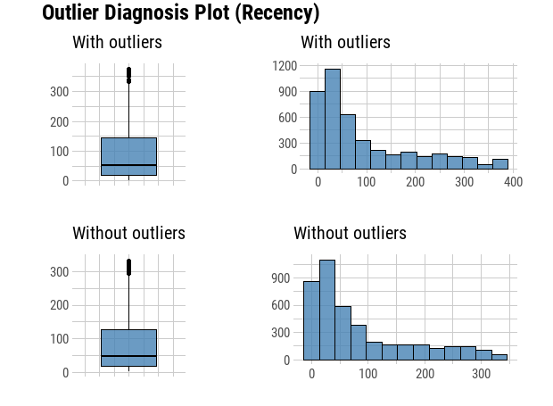
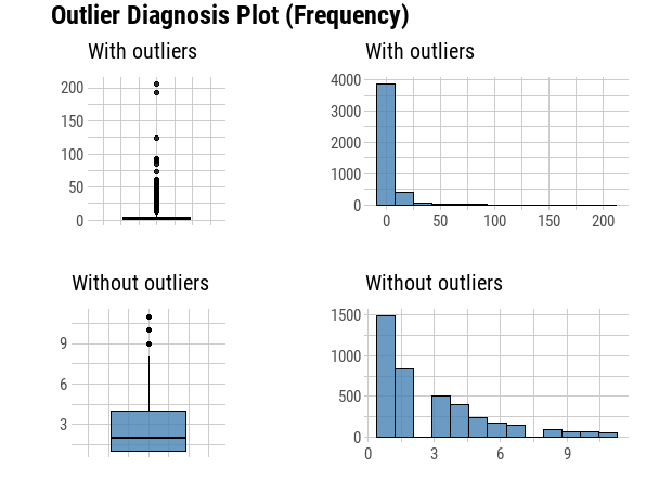
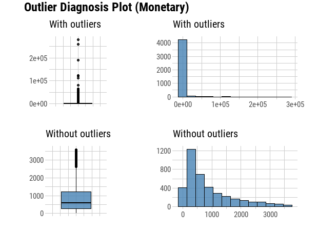
diagnose_outlier(custormer_info) %>% flextable()
plot_outlier(custormer_info, Recency, Frequency, Monetary)
check_Cor <- custormer_info %>% select("Recency", "Frequency", "Monetary")
corrplot(cor(check_Cor),
type = "upper", method = "ellipse", tl.cex = 0.9)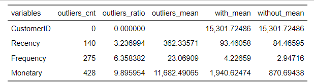
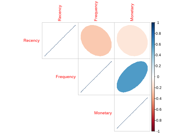
Recency has negative corelation with Frequency and Monetary, while Frequency has positive correlation with Monetary.
# Feature Scale
rfm_Scaled <- scale( select(custormer_info, -"CustomerID"))
rownames(rfm_Scaled) <- custormer_info$CustomerID
summary(rfm_Scaled)
head(rfm_Scaled,2)
Recency Frequency Monetary
Min. :-0.9217 Min. :-0.4270 Min. :-0.23428
1st Qu.:-0.7522 1st Qu.:-0.4270 1st Qu.:-0.19764
Median :-0.4233 Median :-0.2947 Median :-0.15436
Mean : 0.0000 Mean : 0.0000 Mean : 0.00000
3rd Qu.: 0.5038 3rd Qu.: 0.1024 3rd Qu.:-0.03804
Max. : 2.7965 Max. :26.5698 Max. :33.49366
Recency Frequency Monetary
12347 -0.9017486 0.36702571 0.28648198
12348 -0.1740543 -0.02998626 -0.01736572Cluster Validation:
Step one, assess the clustering tendency to see if applying clustering is suitable for the data.
# Compute Hopkins statistic for rfm_scaled dataset
set.seed(123)
hopkins(rfm_Scaled, n = nrow(rfm_Scaled)-1)
The H value = $H 0.007978077 which is far below the threshold 0.05. Then we can reject the null hypothesis and conclude that the data set is significantly a clusterable data.
Step two, use Statistical testing methods to evaluate the goodness of the clustering results, choose the best algorithm and the optimal number of clusters
We start by cluster internal measures, which include the connectivity, silhouette width and Dunn index. We use clVlid function to compute simultaneously these internal measures for multiple clustering algorithms in combination with a range of cluster numbers.
clmethods <- c("hierarchical","kmeans","pam")
intern <- clValid(rfm_Scaled, nClust = 2:6,
                  clMethods = clmethods, validation = "internal", maxitems=nrow(rfm_Scaled))
summary(intern)
Clustering Methods:
hierarchical kmeans pam
Cluster sizes:
2 3 4 5 6
Validation Measures:
2 3 4 5 6
hierarchical Connectivity 4.6496 10.6972 13.6139 20.1841 21.6841
Dunn 0.3050 0.2483 0.2910 0.3309 0.3309
Silhouette 0.9450 0.9381 0.9168 0.8892 0.8890
kmeans Connectivity 16.9357 19.1258 66.0889 86.0333 113.3933
Dunn 0.0270 0.0268 0.0004 0.0005 0.0012
Silhouette 0.9257 0.8713 0.5939 0.6162 0.5960
pam Connectivity 43.5409 112.5706 143.5194 230.9635 194.6619
Dunn 0.0003 0.0006 0.0004 0.0003 0.0005
Silhouette 0.5607 0.4615 0.4762 0.3533 0.3886
Optimal Scores:
Score Method Clusters
Connectivity 4.6496 hierarchical 2
Dunn 0.3309 hierarchical 5
Silhouette 0.9450 hierarchical 2 It can be seen that hierarchical clustering performs the best in each case, and the optimal number of clusters seems to be two using the Connectivity and Silhouette measures, and five using the Dunn measure.
Next, the stability measures can be computed as follow:
stab <- clValid(rfm_Scaled, nClust = 2:6, clMethods = clmethods,
                validation = "stability", maxitems=nrow(rfm_Scaled))
# Display only optimal Scores
optimalScores(stab)
Score Method Clusters
APN 0.0008468928 hierarchical 2
AD 0.8419747548 pam 6
ADM 0.0214144821 hierarchical 2
FOM 0.8562296447 kmeans 6The values of APN, ADM and FOM ranges from 0 to 1, AD has a value between 0 and infinity, and smaller values are preferred. For the APN and ADM measures, hierarchical clustering with two clusters again gives the best score. For AD measure, PAM with six clusters has the best. For FOM measure, Kmeans with six clusters has the best score.
Determine the optimal number of clusters for K-means clustering. The NbClust package provides 30 indices for choosing the best number of clusters
nb <- NbClust(rfm_Scaled, distance = "euclidean", min.nc = 2,
              max.nc = 10, method = "kmeans")
fviz_nbclust(nb)
Among all indices:
===================
* 2 proposed 0 as the best number of clusters
* 1 proposed 1 as the best number of clusters
* 3 proposed 2 as the best number of clusters
* 7 proposed 3 as the best number of clusters
* 4 proposed 4 as the best number of clusters
* 1 proposed 5 as the best number of clusters
* 2 proposed 6 as the best number of clusters
* 2 proposed 7 as the best number of clusters
* 2 proposed 8 as the best number of clusters
* 1 proposed 9 as the best number of clusters
* 1 proposed 10 as the best number of clusters
Conclusion
=========================
* According to the majority rule, the best number of clusters is 3 .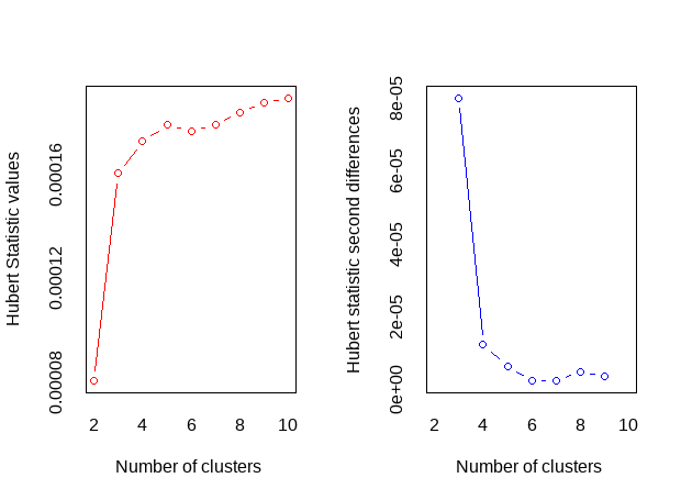
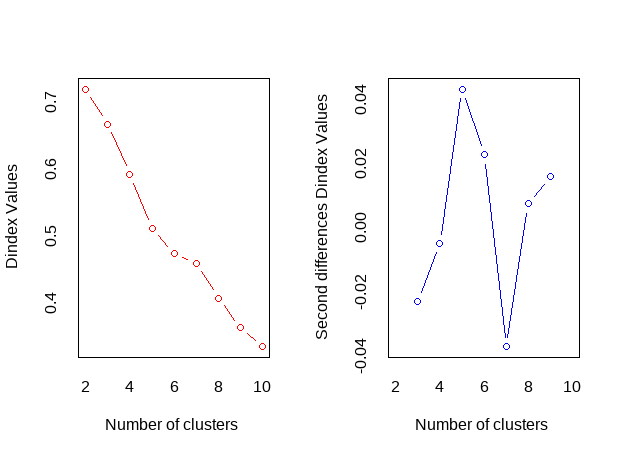
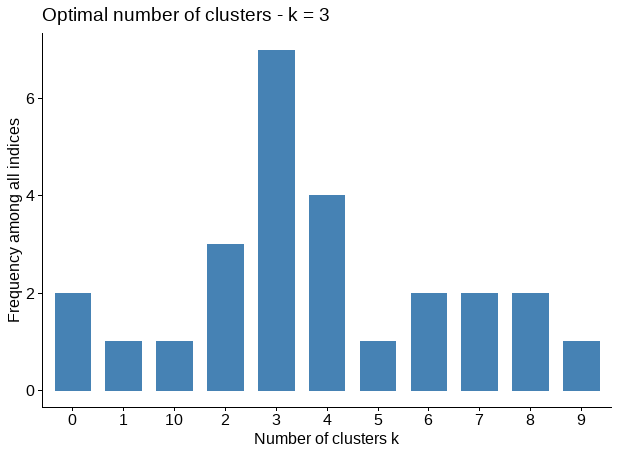
According to the majority rule, the best number of clusters for K-means clustering algorithm is 3.
Visualize cluster plots
# Hierarchical clustering with K=2, and K=5
hc.res <- eclust(rfm_Scaled, "hclust", k = 2, hc_metric = "euclidean",hc_method = "ward.D2", graph = FALSE)
hc.res5 <- eclust(rfm_Scaled, "hclust", k = 5, hc_metric = "euclidean",hc_method = "ward.D2", graph = FALSE)
### pam clustering with K=6
pam.res <- pam(rfm_Scaled, 6, metric = "euclidean", stand = FALSE)
### Clustering: Compute k-means with k = 3
set.seed(123)
km.res <- kmeans(rfm_Scaled, centers = 3, nstart = 35)
p1 <- fviz_cluster(hc.res, geom = "point",  ggtheme = theme_minimal())+ggtitle("Hierarchical clustering K=2")
p2 <- fviz_cluster(hc.res5, geom = "point",  ggtheme = theme_minimal())+ggtitle("Hierarchical clustering K=5")
p3 <- fviz_cluster(pam.res, geom = "point",  ggtheme = theme_minimal())+ggtitle("Pam clustering K=6")
p4 <- fviz_cluster(km.res, geom = "point", data=rfm_Scaled,ggtheme = theme_minimal())+ggtitle("k-means clustering K=3")
plot_grid(p1, p2, p3, p4, nrow=2, ncol=2)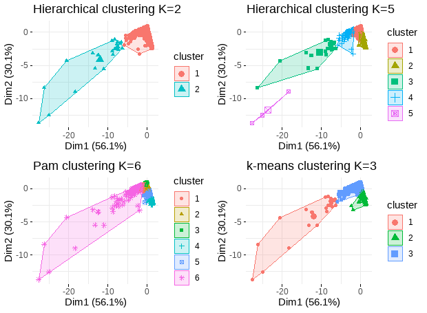
Analysis clustering results
names(km.res)
# Lets also check the amount of customers in each cluster.
km.res$size
# centroids from model on normalized data
km.res$centers
[1] 24 1094 3207
Recency Frequency Monetary
1 -0.8656131 8.57193980 9.37531267
2 1.5311005 -0.35115225 -0.17084250
3 -0.5158245 0.05563892 -0.01188207# In original customer information
rfm_k3 <- custormer_info %>%
mutate(Cluster = km.res$cluster)
rfm_k3 %>% select(-"CustomerID")%>% group_by(Cluster) %>% summarise_all("mean") %>%
ungroup() %>% kable() %>% kable_styling()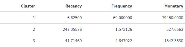
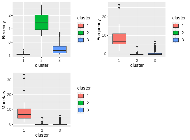
As we can see from the results, we have 3 demonstrable clusters. Cluster 1 has the newest transactions, the highest frequency, and transaction amount compared to the other 2 clusters, which contains the most valuable customers.
# rfm features pairwise plot for each cluster
library(GGally)
rfm_df <- as.data.frame(rfm_Scaled)
rfm_df$cluster <- km.res$cluster
rfm_df$cluster <- as.character(rfm_df$cluster)
ggpairs(rfm_df, 1:3, mapping = ggplot2::aes(color = cluster, alpha = 0.5),
diag = list(continuous = wrap("densityDiag")),
lower=list(continuous = wrap("points", alpha=0.9)))
# rfm features boxplot for each cluster
f1<-ggplot(rfm_df, aes(x = cluster, y = Recency)) +
geom_boxplot(aes(fill = cluster))
f2<-ggplot(rfm_df, aes(x = cluster, y = Frequency)) +
geom_boxplot(aes(fill = cluster))
f3<-ggplot(rfm_df, aes(x = cluster, y = Monetary)) +
geom_boxplot(aes(fill = cluster))
plot_grid(f1, f2, f3)
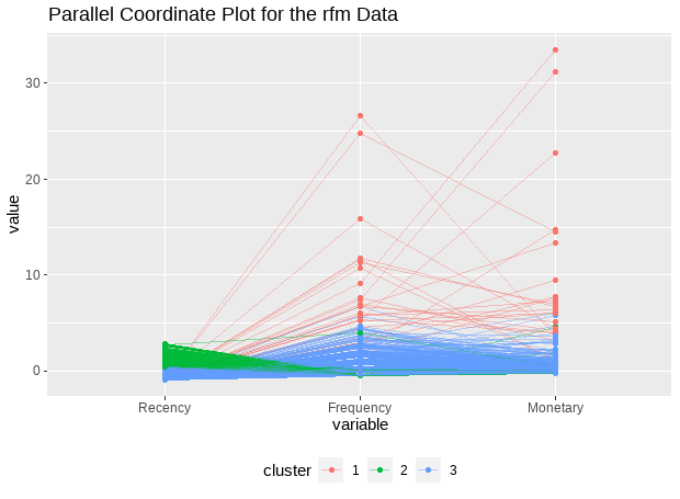
# Parallel coordiante plots allow us to put each feature on seperate column and lines connecting each column
ggparcoord(data = rfm_df, columns = 1:3, groupColumn = 4, alphaLines = 0.4, title = "Parallel Coordinate Plot for the rfm Data", scale = "globalminmax", showPoints = TRUE) + theme(legend.position = "bottom")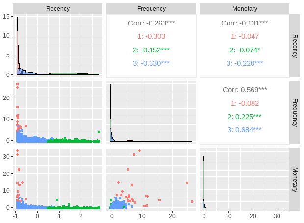
RFM analysis
rfm_score <- rfm_table_customer(data=rfm_k3, customer_id=CustomerID, n_transactions=Frequency, recency_days=Recency,  total_revenue=Monetary,recency_bins = 5,frequency_bins =5, monetary_bins = 5)
rfm_details<-rfm_score$rfm

rfm_segments <- rfm_details %>%
  mutate(segment = ifelse(recency_score >= 4 & frequency_score >= 4 & monetary_score >= 4, "Champion",
                          ifelse(recency_score >= 2 & frequency_score >= 3 & monetary_score >= 3, "Loyal Customer",
                                 ifelse(recency_score >= 3 & frequency_score <= 3 & monetary_score <= 3, "Potential Loyalist",
                                        ifelse(recency_score >= 4 & frequency_score <= 1 & monetary_score <= 1, "New Customer",
                                               ifelse((recency_score == 3 | recency_score == 4) & frequency_score <= 1 & monetary_score <= 1, "Promising",
                                                      ifelse((recency_score == 2 | recency_score == 3) & (frequency_score == 2 | frequency_score == 3) &
                                                               (monetary_score == 2 | monetary_score == 3), "Need Attention",
                                                             ifelse((recency_score == 2 | recency_score == 3) & frequency_score <= 2 & monetary_score <= 2, "About to Sleep",
                                                                    ifelse(recency_score <= 2 & frequency_score > 2 & monetary_score > 2, "At Risk",
                                                                           ifelse(recency_score <= 1 & frequency_score >= 4 & monetary_score >= 4, "Can't lose them",
                                                                                  ifelse(recency_score <= 2 & frequency_score == 2 & monetary_score == 2, "Hibernating", "Lost")))))))))))
head(rfm_segments,5)
# A tibble: 5 × 9
customer_id recency_days transaction_count amount recency_score frequency_score monetary_score rfm_score segment
<dbl> <dbl> <dbl> <dbl> <int> <int> <int> <dbl> <chr>
1 12347 3 7 4310 5 5 5 555 Champion
2 12348 76 4 1797 2 4 4 244 Loyal Customer
3 12349 19 1 1758 4 1 4 414 Lost
4 12350 311 1 334 1 1 2 112 Lost
5 12352 37 6 1405 3 5 4 354 Loyal Customercheck segments threshold and size
segments_summary<-rfm_segments %>%
  group_by(segment) %>%
  summarise(counts=n())  %>%
  ungroup() %>%
  arrange(-counts)
rfm_score$threshold
head(segments_summary, 8)
# A tibble: 5 × 6
recency_lower recency_upper frequency_lower frequency_upper monetary_lower monetary_upper
<dbl> <dbl> <dbl> <dbl> <dbl> <dbl>
1 1 16 1 2 3 249
2 16 34 2 3 249 487
3 34 73 3 4 487 923
4 73 182 4 6 923 2029.
5 182 375 6 206 2029. 278954
# A tibble: 8 × 2
segment counts
<chr> <int>
1 Lost 1029
2 Potential Loyalist 932
3 Champion 902
4 Loyal Customer 892
5 About to Sleep 281
6 Need Attention 173
7 At Risk 62
8 Hibernating 54fig1<-rfm_plot_median_recency(rfm_segments)
fig2<-rfm_plot_median_frequency(rfm_segments)
fig3<-rfm_plot_median_monetary(rfm_segments)
plot_grid(fig1, fig2, fig3)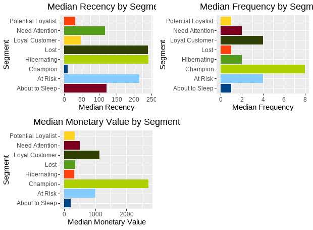
The souce code used to create this blog can be found here.